

Sunset is a trap. It is the moment when the light is at its most saturated and least believable, when the sky does things that look fake even when you are standing in front of them. Most attempts at it either go timid—muting the palette until the whole thing looks like a memory of a sunset rather than the event itself—or they go garish, cranking the saturation until the piece feels like a screensaver. The difficulty is not in capturing the colour.
It is in making the colour feel like it belongs to something real, something that happened in a specific place at a specific hour, and not just a gradient pulled from a stock library.
Three artists working in entirely different registers all reached for that light, and each of them found a different way to make it land.
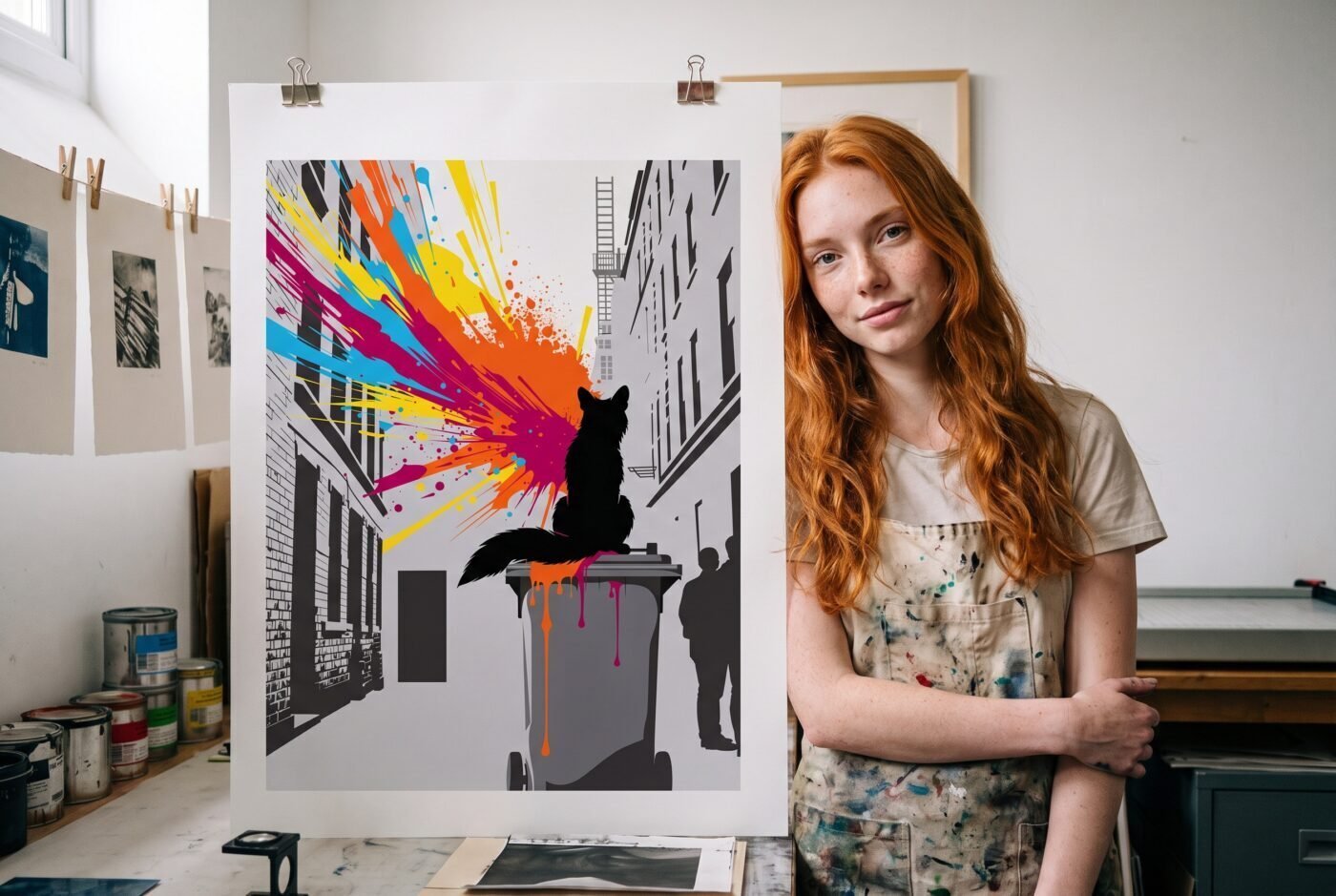
The Fox, the Cart, the Rooftop
Sunset Leaving the Animal by Kai Reynolds puts a fox on a wheelie bin and bursts the sunset out of its tail like a flare. The silhouette is precise—clean vector work, the kind where every edge is deliberate—and the explosion of warm colour behind it does not bleed or soften. It stays contained, graphic, almost architectural. The fox is still, the bin is still, and the colour is doing all the movement.
What this piece does that the others do not is treat the sunset as a punctuation mark rather than a wash. It is not atmospheric. It is declarative. Charlotte called it “a striking burst of color” that “elevates this fox silhouette into an energetic must-have,” and Valentina noted that Reynolds “captures the essence of urban energy with a vibrant burst that animates the stark London grey.” I gave it a nine because the colour burst feels alive against the precise vector silhouette, making the piece both dynamic and engaging.
The paper will matter here—you want something with enough weight to hold the saturation without the colour looking like it is sitting on top of the sheet. A 230gsm satin, which is a semi-gloss finish that adds depth without glare, will let the warm tones bloom without going flat.
Cold Before Dinner by Chris Vega sets a paletero cart at the golden hour with a line of kids waiting, the cart lettered exactly: PALETAS. The sunset here is not a burst—it is a wash, the kind of light that gets into everything, that turns the whole scene amber and makes the shadows go long. The cart, the kids, the street—they are all inside the light rather than standing against it. What this piece does that the others do not is distribute the warmth. There is no single focal explosion.
The colour is structural, holding the composition together, turning the everyday into something worth stopping for.
Charlotte said it is “a captivating blend of color and humor” that “exudes warmth and LA street culture pride,” and Valentina called it “a vibrant piece that captures the essence of LA street culture with charm and authenticity.” I scored it an eight—a point lower than my colleagues—because while the piece captures the vibrant energy of LA street culture with bold colours and a dynamic scene, the canvas format introduces a slight softness that dilutes the crispness I wanted from the light.
On canvas, which is a textured cotton weave stretched over a wooden frame, the image gets a tactile presence but loses some of the snap that the sunset demands. If this were on a heavyweight poster stock, it would have hit harder.
Skyline Igniting Her by Naomi Brooks puts a woman on a rooftop at sunset, turned toward the skyline, and lets the bloom of colour erupt around her like a halo or a cloud. The figure is gestural, painterly, and the colour is doing something between background and foreground—it is not behind her and it is not in front of her, it is with her, part of the same event.
What this piece does that the others do not is make the sunset feel internal, as though the light is as much about the figure as it is about the sky.
Charlotte observed that Brooks “captures the essence of evening energy and invokes optimism with a vibrant eruption of colors,” and Valentina said “the artwork confidently captures the energetic neo-expressionism with vivid color blooms.” I gave it an eight because the expressive eruption of colour creates an energetic dialogue between the figure and the sky, but the bloom occasionally threatens to overwhelm the figure rather than anchor to it.
On poster stock—a smooth, bright white base that keeps colours true—the piece will hold its intensity, but you will want to frame it under glass to protect that vibrant surface from UV fade, which is when sunlight breaks down the pigment and turns the warm tones muddy over time.
Where We Split
The panel put a point between the highest and the lowest, and that point is not trivial. Charlotte and Valentina both gave Cold Before Dinner a nine, and I gave it an eight. The disagreement is about medium. They saw the canvas as adding warmth and presence—turning the scene into something you could almost step into. I saw it as softening the precision that the light required. Canvas has texture, and texture scatters light.
That scattering can be beautiful, but in a piece where the sunset is the structural element holding the composition together, I wanted crispness, and the canvas gave me softness instead. If Vega had printed this on a heavyweight matte poster stock—a flat, smooth surface that keeps edges sharp—I would have scored it a nine as well.
The split is also about where the sunset lives in each composition. Reynolds puts it behind the subject, Vega puts it all around, and Brooks puts it in conversation with the figure. My nine for Reynolds and my eight for Brooks came down to control. Reynolds keeps the burst contained, graphic, impossible to ignore. Brooks lets it bloom, and in doing so introduces a small amount of ambiguity—is the colour part of the sky, or is it part of the figure’s emotional state?
That ambiguity is intentional, and it is what makes the piece neo-expressionist rather than realist, but it also means the sunset occasionally feels like an effect rather than an event.
The Verdict
I would live with Sunset Leaving the Animal. It is the one that commits hardest to the difficulty of the light, that makes the sunset a graphic decision rather than an atmospheric one, and that trusts the viewer to meet it on those terms. The fox is still, the colour is loud, and the whole piece feels like it knows exactly what it is doing.
Cold Before Dinner is for the reader who wants to live inside the warmth rather than look at it—the one who values atmosphere over precision, who wants the light to feel like a place rather than a moment. On the right substrate, which is the material the image is printed on, this piece would be a nine. On canvas, it is an eight that still delivers.
Skyline Igniting Her is for the reader who wants the sunset to mean something beyond itself, who is drawn to the emotional register of colour rather than its optical accuracy. It is the most painterly of the three, and the one that asks you to feel the light rather than see it.
Matte fine art poster. Ships free within the continental US.