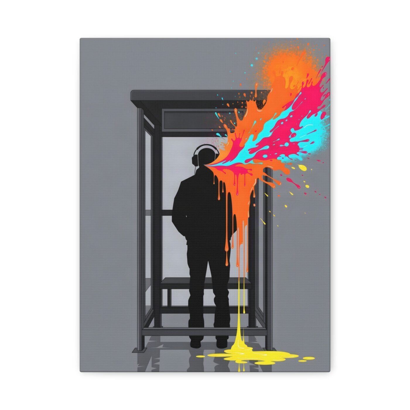

The rule is one burst per piece, and I put it where the sound would actually escape.
I work in hard-edged grey vectors—London restraint, the bus stop silhouette—with exactly one aerosol-and-pour explosion. Never two. The burst is always saturated, always placed where the energy lives in the scene, and it is never decorative.
In this one, it comes from the headphones. A figure waiting, still, and the only movement is what is leaking out of their head.

The grey goes down as a cutout, the colour as a live mark
The silhouette is a vector: clean edge, no texture, the kind of precision you get when you draw it on a screen and cut it with a blade. It reads as a shape before it reads as a person.
The burst is aerosol and acrylic pour, laid down wet. I start with the spray—loose, fast, no second pass—then pour the paint while it is still moving. The edge stays soft because it was never controlled.
Charlotte called it visually striking. Valentina said the contrast was impeccable. What they both noticed is the same thing: grit and geometry are not opposites—they are two ways of saying the same thing, and the join is where you look.
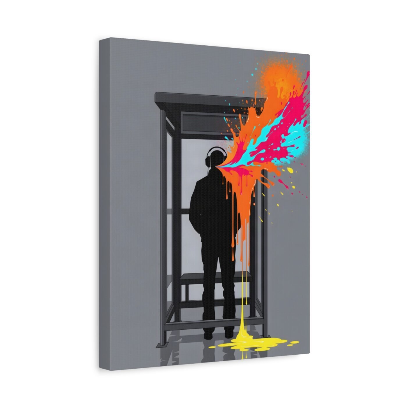
One burst is the constraint that makes the choice matter
If I allowed two bursts, the first one would stop meaning anything. The rule forces me to decide: where is the energy actually located?
Here, it is in the headphones. Not the face, not the posture, not the street. The figure is still and the sound is not.
Ruby got it exactly right when she said the piece captures energy and structure. The structure is the grey. The energy is the one place I let the paint move.
It is for a hallway or a room with hard surfaces
This works above a console, in a hallway, or on a wall with concrete or white paint. It wants space and it does not want pattern around it.
It is not for a soft room, and it is not for anyone who finds a bright burst distracting. The colour is the subject, not an accent.
Gallery-wrapped canvas, in 3 sizes — 12×16, 18×24, 24×32 in. Ships free within the continental US.