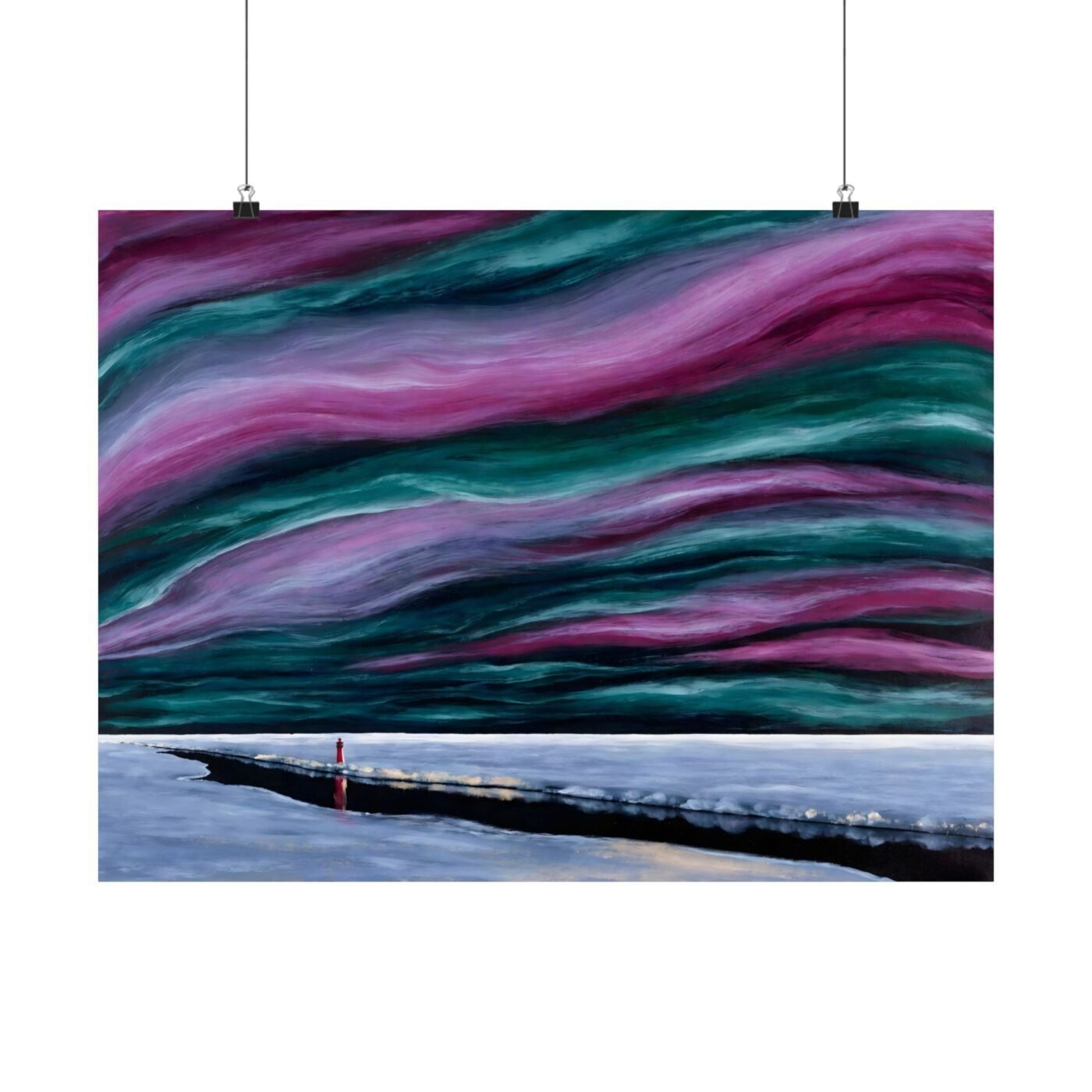

Larsson is asking archival matte paper to hold green next to magenta without a gap between them. That is harder than it sounds, and it is why this piece works as a poster first.

The aurora lives in the gradient
The northern lights here are not shapes. They are bands of colour stepping from pale gold through cold blue into green and magenta, and what you are paying for is whether those steps are smooth or whether you see lines between them. Banding – visible steps in a gradient – is the thing that kills a sky like this. The matte coating on museum-grade archival paper gives pigmented inks somewhere to sit without spreading, so each band holds its edge and the flow reads as continuous.
You get about sixteen million colours at 300 DPI – dots per inch, the resolution at which your eye stops counting them – and all sixteen million are working.
Canvas flattens this. The weave breaks up fine colour shifts, and a gradient this delicate turns into broad strokes. You lose the thing that makes it an aurora.
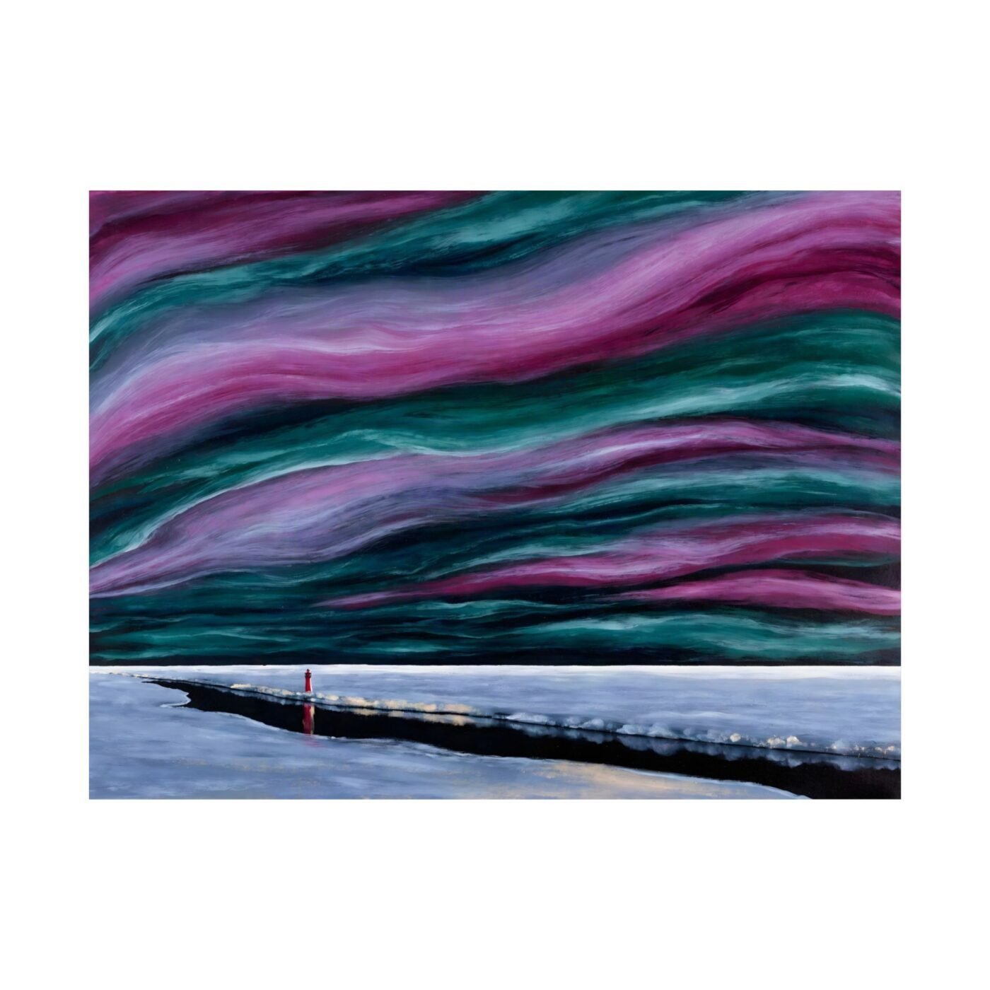
The red lighthouse does two jobs
There is a red structure – a lighthouse – on the left third, sitting on the ice. It is small, maybe two per cent of the frame, and it is the only warm thing in a cold composition. That red is a navigation mark for your eye, and it is also a test: if the ink holds that red sharp against the pale ice without bleeding, the rest of the piece is in control. It does. The edge is clean.
That sharpness is what lets the poured sky above it feel loose without feeling accidental.
The strip of ice runs horizontal, low in the frame, and below it is a reflection. The reflection is lighter than the sky, almost white, and it should not draw attention. It does not. That restraint – knowing when to pull back – is what keeps the composition from tipping into decorative.
What arrives and where it goes
This ships flat, unframed, in a rigid mailer. The paper is 189 gsm or 192 gsm depending on the supplier batch – grams per square metre, which is thickness – and it feels like a page from an art book, not a flyer. You will want a frame with a mat, because the white border around the image is part of the breathing room the composition needs. A thin black or natural wood frame, nothing ornate.
It wants a wall with space around it, not a gallery wall where it competes.
The poster format is worth it. This is a piece where the ink and paper are doing exactly what Larsson needed them to do, and you can see the decision in the gradient. Free shipping within the continental United States. See it at full resolution here.
Matte fine art poster, in 3 sizes — 16×12, 24×18, 32×24 in. Ships free within the continental US.