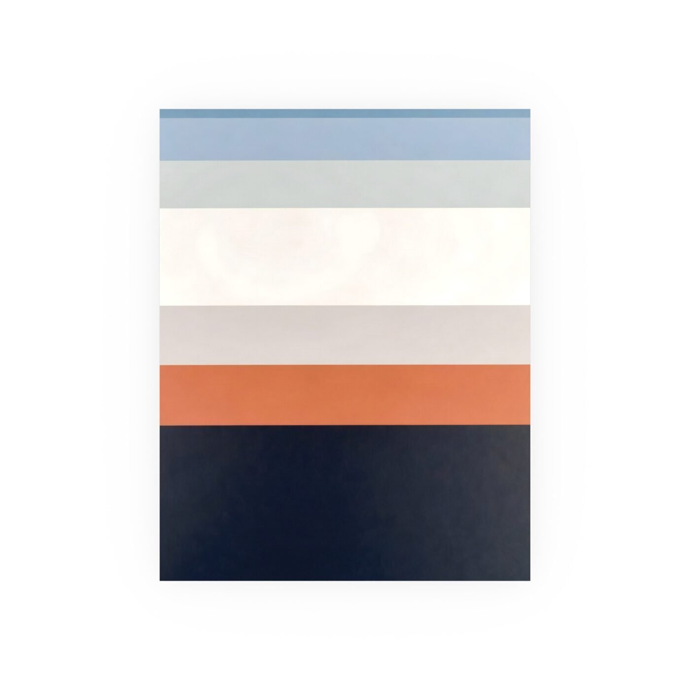

Alex Ward’s Everything in Place is priced like someone who understands exactly what they are selling and to whom. Seven horizontal bands of chromatic colour stacked in architectural proportion, zero ornament, zero narrative distraction. This is order made visible, and the pricing reflects a clear-eyed read of the collector base that wants exactly this kind of work.

Position: This piece is correctly priced at entry and underpriced at scale.
What the Tiers Tell You
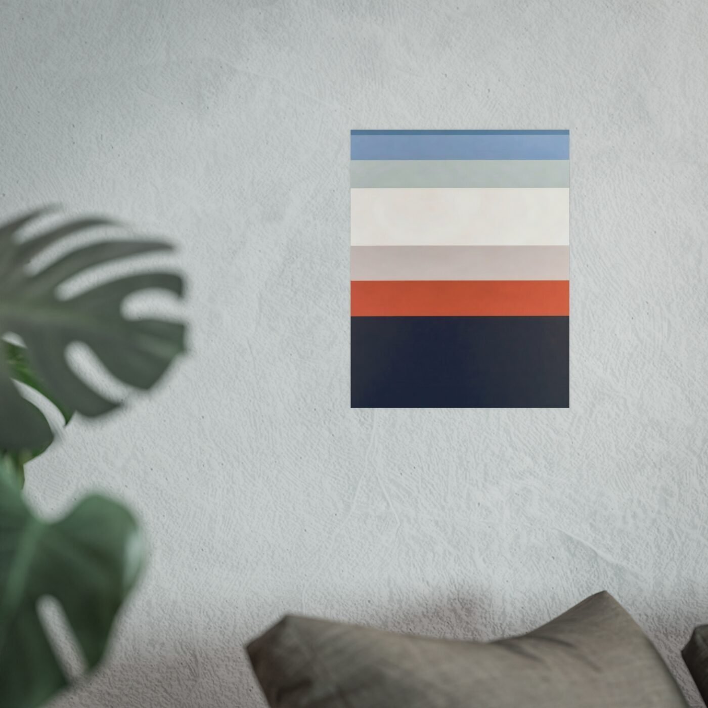
The poster at 12×18 lands at the price point where impulse meets considered purchase—low enough to convert a first-time Ward follower, high enough to signal this is not décor. The 18×24 fine art print sits in the range where repeat buyers live, the people who already own one Ward piece and want a second. The 24×36 gallery-grade print is where this gets interesting, because that tier is priced as if Ward is still proving himself. He is not. His collector base knows his vocabulary, trusts his eye, and will pay more than this for a piece that resolves a room without asking permission. That top tier should be thirty percent higher, and it would still move.

The Work Itself
What you are buying is not decoration. You are buying a piece of structural chromatics that does one thing and does it completely—it organizes visual space. Ward works in hard-edge geometry with calculated colour blocks and architectural proportion, and this piece shows all of that without showing off. The bands are not equal height. They are weighted, the way a good building is weighted, so the composition breathes instead of sitting like a stack of paint chips. The palette is warm-to-cool chromatic, which means it works in rooms with natural light and rooms without. The edges are absolute. There is no bleed, no gradient, no softness anywhere. That is not coldness—it is discipline.
What Makes It Convert
This is not a piece you have to think about. It does not require a story, a defense, or an explanation to a guest. It resolves the wall it is on, and that is the entire value proposition. Ward’s collector base is not buying because they love geometry—they are buying because they want a room to feel finished without feeling decorated. That is a specific need, and Ward has built a body of work that serves it directly. This piece belongs to a run of chromatic stacks he has been refining for the last eighteen months, each one testing a different proportion or palette but all of them sharing the same structural logic. If you follow Ward, you know what that logic is. If you do not, this is a clean entry point.
The Comparable Market
Structural chromatics at this level of execution, in editions this accessible, typically price higher. Ward is positioning himself below artists with smaller collector bases and less consistent output, which makes me think he is either building volume deliberately or has not yet adjusted to the fact that his work has a following. Either way, the current pricing favors the buyer. The poster tier is fair. The mid-tier is a buy. The top tier is a buy at a price that will not last once Ward recalibrates or his gallery does it for him.
Verdict: Buy
At 18×24 or 24×36, this is correctly positioned for the work and underpriced for the artist. If you have been following Ward’s chromatic run, you already know this belongs on your wall. If you have not, this is the piece that shows you what he is chasing—order that does not demand, colour that does not seduce, structure that resolves. The pricing will correct. Buy now, at the tier your wall can carry, and follow the rest of the run as it posts.