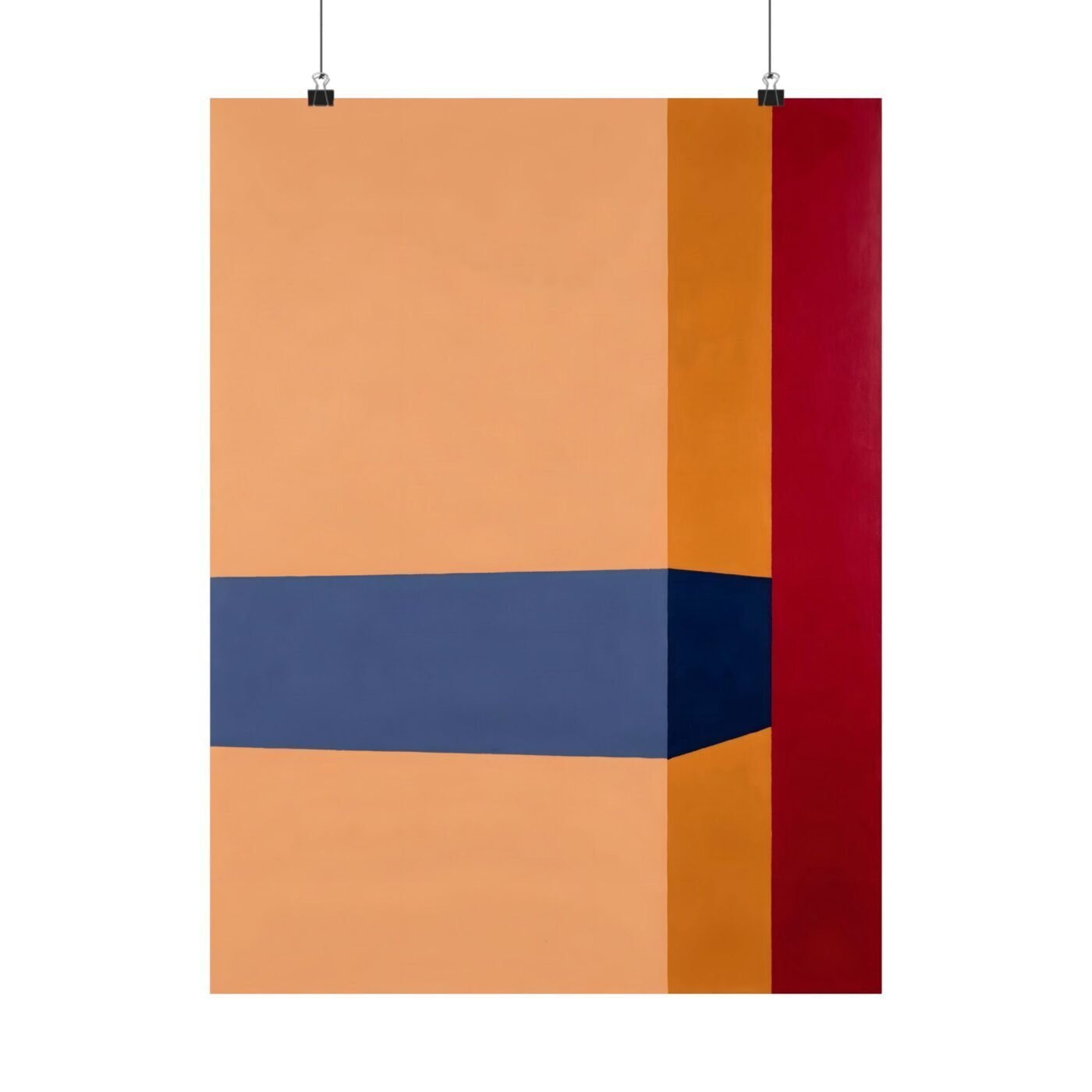

Ruby called the edges sharp, and she was right—but the real precision is in making red feel heavier than ochre.
I am Alex Ward. I build impossible structures out of colour blocks and measured lines. Every proportion is deliberate, every edge is taped before any paint goes down, and I pre-mix every colour so nothing is decided on the wall. What I am after: geometry that could not stand in three dimensions but reads as utterly rigorous in two.
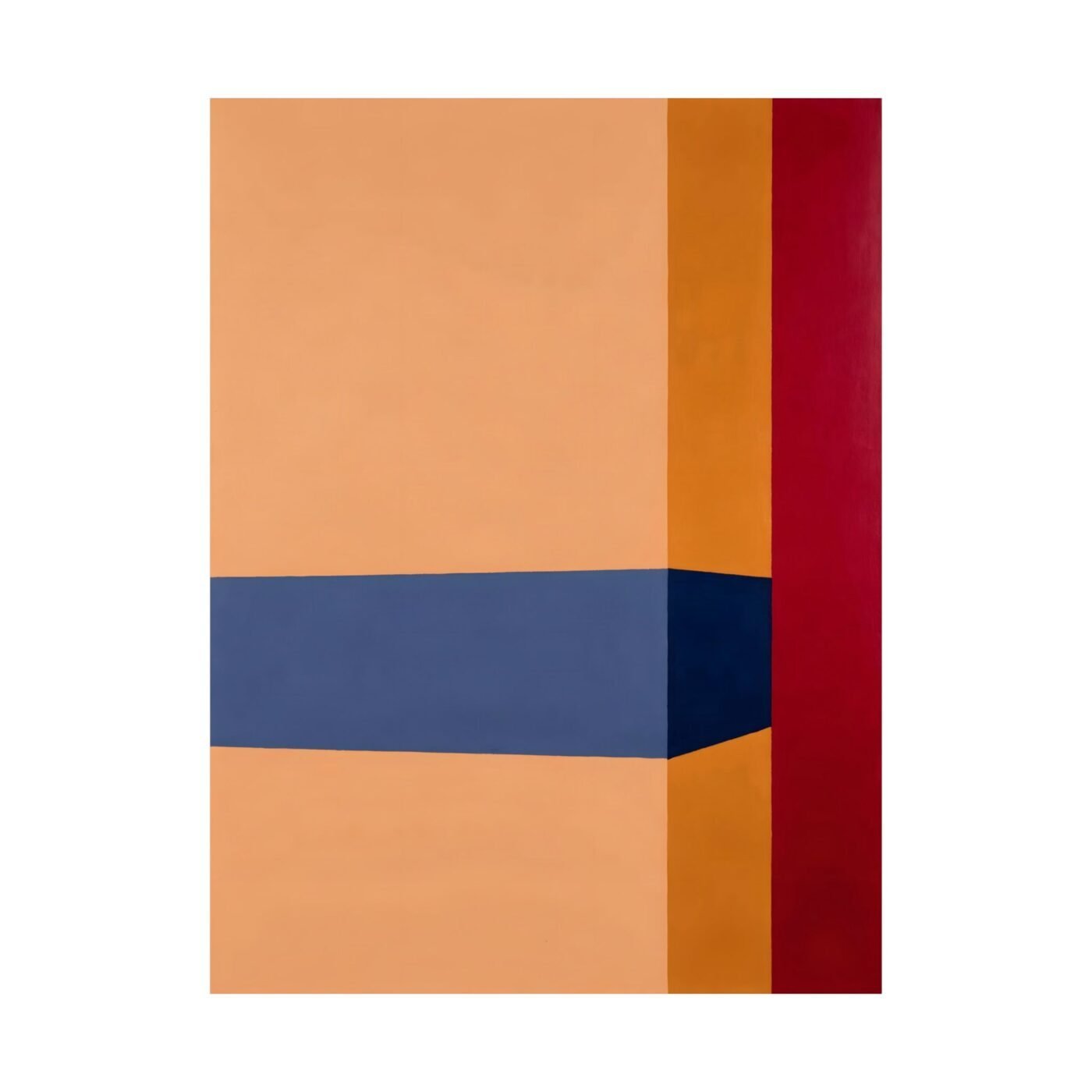
This piece uses colour as architecture. The carmine block anchors the composition while the ochre tries to lift it.

The carmine was mixed to read as weight
Valentina noted the warm and cool tension, which is the structural fact here. Carmine sits in the centre, a red with enough blue in it to feel dense. I mixed it to a specific saturation—warm enough to hold attention, cool enough to act as ballast.
The ochre surrounds it: a yellow leaning toward brown, lighter in value, but not by much. On paper they should feel close. On the wall the carmine drops and the ochre floats. That gap is the entire piece.
The grid was laid first, then broken on purpose
I start every piece with a measured grid. This one divides into thirds vertically, but the horizontal breaks are uneven—deliberately so. The carmine block does not sit at the centre of the canvas. It sits where the weight would settle if this were a physical structure under load.
Charlotte called it visually arresting, and I will take that. The arrest happens because the proportions feel right but the geometry is impossible. A building like this would fall. A print like this holds.
The edges are taped, the surface is flat
Every line in this piece was masked before the colour went down. No bleed, no gradient inside a block, no visible brush mark. The surface is flat matte archival paper, printed with pigmented inks that will not shift.
Ruby pointed out the piece suits matte paper perfectly, and she is correct. Gloss would introduce a gradient the work does not want. This is about planes of colour meeting at exact lines, and the matte holds that without reflection.
Museum-grade archival stock, printed to order in the USA, shipped flat. No framing required but it takes one cleanly if you want it.
For: A designed room that already has its palette sorted and needs one measured thing on the wall. For someone who notices when a line is off by a degree.
Not for: A space that wants visible texture or anything that looks like it was made quickly.
Matte fine art poster, in 3 sizes — 12×16, 18×24, 24×32 in. Ships free within the continental US.