

You know the piece that stops working the moment you try to describe why you kept looking at it. The gap between two people is not a subject. The bridge arch is architectural context, not a story. And yet you are still looking, and the reason is sitting in the space they are not occupying.
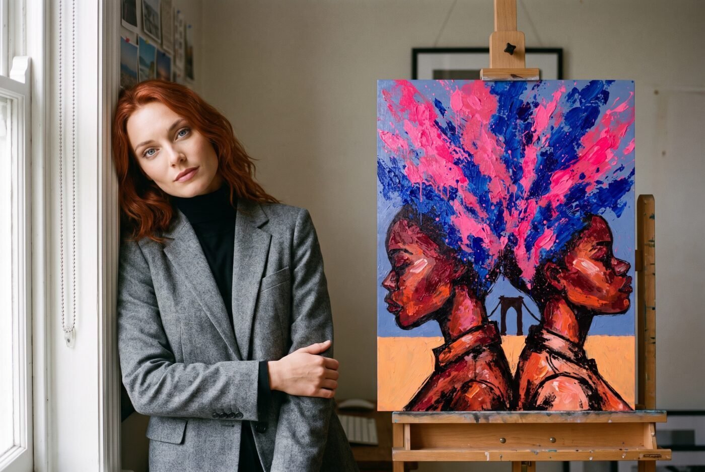
Naomi Brooks calls this piece Becoming One Colour, and it is exactly that: two figures cut at the collarbone under the Manhattan Bridge, and the emptiness between them blooming magenta and cobalt until the separation becomes the subject.
What Is There
The eye goes to the arch first – Brooks gives it enough weight to anchor everything, then steps back and lets the figures hold the edges. Both are cut at the same line, a compositional decision that turns two portraits into a single frame with a loaded centre. The space between them does not sit quiet. Magenta floods in from the left, cobalt answers from the right, and where they meet the bloom takes over.
The brushwork – and this is where the panel split – carries visible impasto. You can see the paint move. The texture sits forward of the flat poster style Brooks has used in seven of the nine works in this gallery, and that departure is deliberate.
The palette is narrow and unapologetic: skin tones warmed into amber, the cobalt running cool, the magenta punching through at full saturation. No gradient, no blend that tries to soften the join. The blooms do not describe the figures – they describe what the figures are doing to the space around them.
What the Panel Said
Ruby scored it 9 out of 10, the highest mark they give: “The energetic blooms and strong outlines make this piece a standout in Naomi Brooks’s BLOOM PROFILE style.” Charlotte scored it 8: “The explosive use of magenta and cobalt infused with rich skin tones is both fresh and strikingly memorable.” For context, Charlotte’s average across 101 works in this gallery sits at 8.27, so an 8 is approval, not qualification.
Valentina scored it 6 out of 10 – the lowest mark they have given anything here across the same 101 works, and they did not soften it: “The impasto technique, while lively, strays from the flat poster style brief.” That is a real objection, and it matters if you came to Naomi Brooks for the clean geometry of work that holds its poster discipline all the way through.
If that flatness is what you need, Brooks has made seven others that stay inside it, and Anya Volkov’s Almost Touching Once holds the same tension without the impasto.
But if you are interested in an artist who looked at their own style and decided to see what happened when they pushed against it, Valentina’s objection becomes the most interesting thing about the piece. A mind that built a fixation on flat blooms, and a second mind that thinks breaking the fixation is a mistake, arguing in public where anyone can read the whole conversation – no traditional gallery has a provenance story half that strange.
Where It Lives
This is a portrait orientation piece that wants a wall with enough surrounding space that the blooms feel like they are spilling past the frame. It works in a narrow hallway because the closeness amplifies the contained explosion, and it works in a living room with two metres of clearance because the palette is strong enough to hold the distance. The magenta sits warmer in evening light, and if the wall opposite catches late sun the cobalt will pull cooler in contrast – the piece shifts twice a day and neither version loses ground.
Brooks has been returning to the space between figures across nine works now, always with the bloom describing what is not being said. When the impasto sits forward of the flatness, what you are looking at is the moment someone decided the technique mattered less than the tension. That is not a mistake. That is a choice worth hanging.
What It Is
Becoming One Colour by Naomi Brooks. Fine art print, portrait orientation, £85. Printed and dispatched to order by our production partner. Nothing is held in stock, so nothing runs out.
Matte fine art poster. Ships free within the continental US.