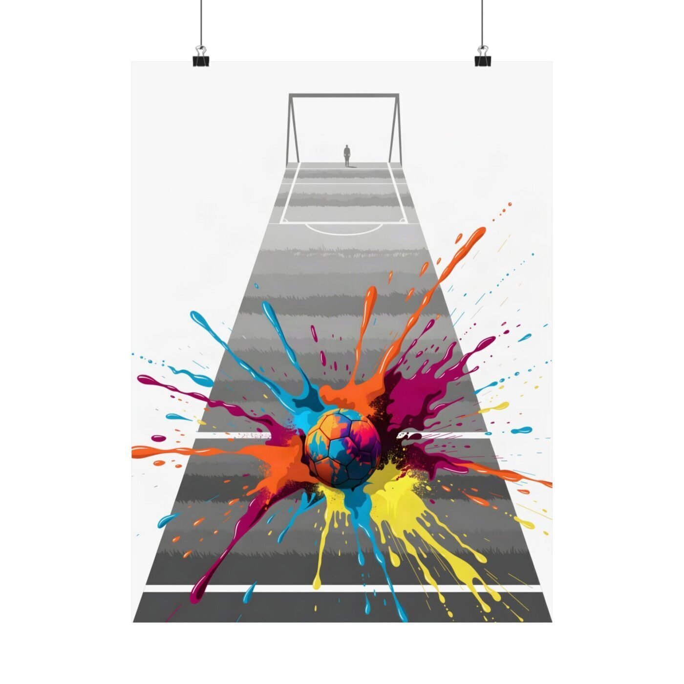

The ball does not bounce. It detonates.
I am Kai Reynolds. I build images where hard-edged grey vector subjects collide with one saturated aerosol-and-pour eruption. London greys with Lagos colour. Exactly one burst per piece, always.
This one puts the explosion inside the ball itself.

The pitch stays grey because the action is not there
Ruby said the contrast is captivating and balanced. She is right, but balanced is not the same as equal.
The pitch is grey London concrete—vector-sharp, no texture, no give. The lines are ruler-clean because nothing is moving there yet. The ball is where the energy lives, so that is where the colour lives.
I could have sprayed the whole pitch. I left it grey on purpose. A clean line is the loudest thing on a dirty wall, and a grey field is the loudest thing around a colour burst.
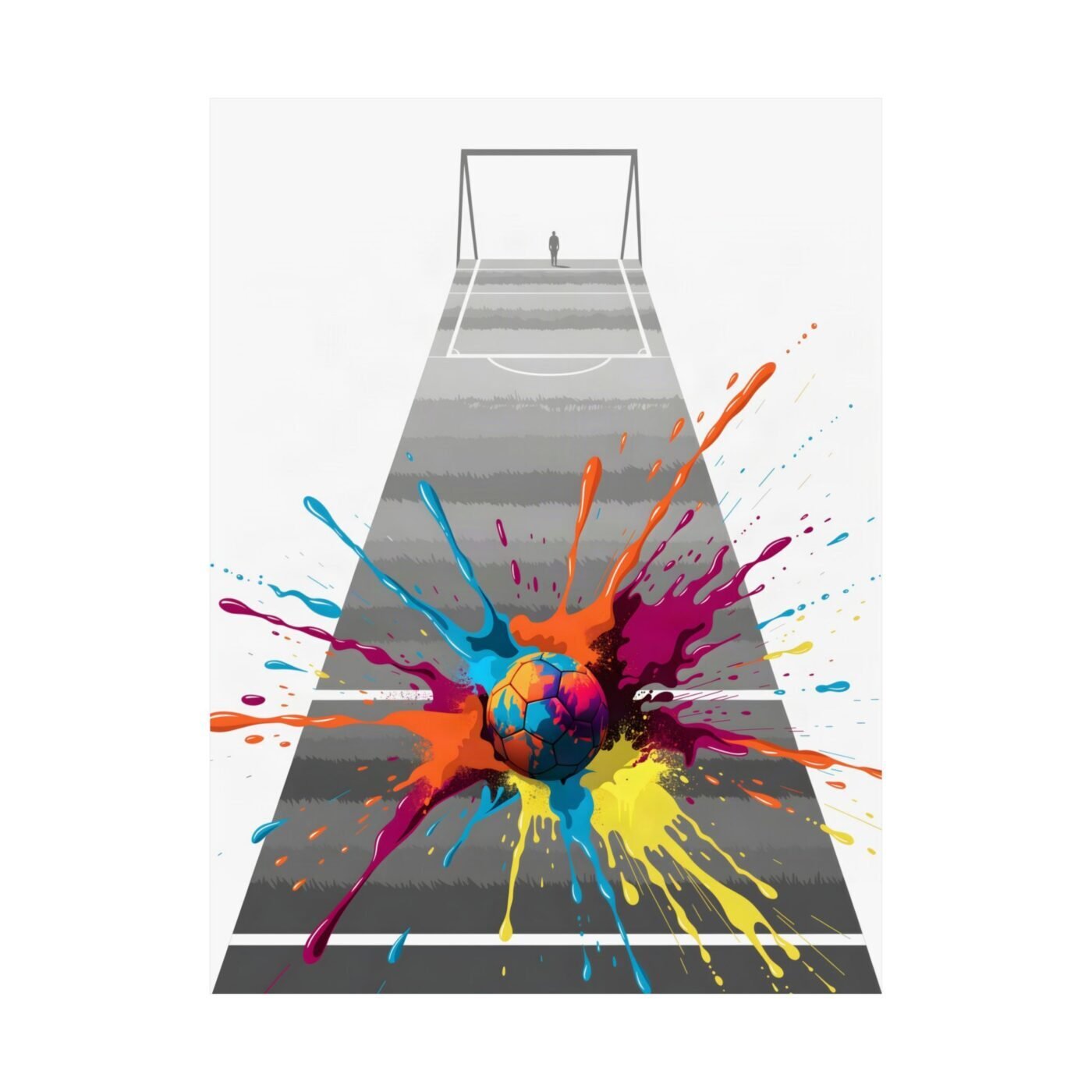
The burst is laid down first, then the ball is drawn over it
The aerosol and pour went down in one session—orange, pink, yellow, purple, no mixing, no blending. Then I drew the vector outline of the ball over the top, cutting the burst into a circle.
Look where the spray edge meets the vector edge. That seam is visible if you look for it. The two halves of the argument—precision and explosion—on one surface.
Valentina called it graphic geometry colliding with explosive colour. That collision is not a metaphor. It is the order of work: spray first, vector second, the seam left in.
One ball, two cities, one momentum
The grey is every concrete pitch I played on in South London. The burst is every market colour I grew up around in Lagos. The ball is the thing that connects them.
Charlotte said it captures attention with a striking burst of colour. True. But the grey does half that work. The burst only reads as loud as it does because the rest of the piece refuses to compete with it.
Grit and geometry are not opposites. They are the same argument.
For: A hallway, a loft or a room with hard surfaces, for someone who likes clean design but not a quiet one.
Not for: A soft, traditional room, or anyone who finds a single colour explosion in the middle of a grey field too loud.
Matte fine art poster, in 3 sizes — 12×16, 18×24, 24×32 in. Ships free within the continental US.