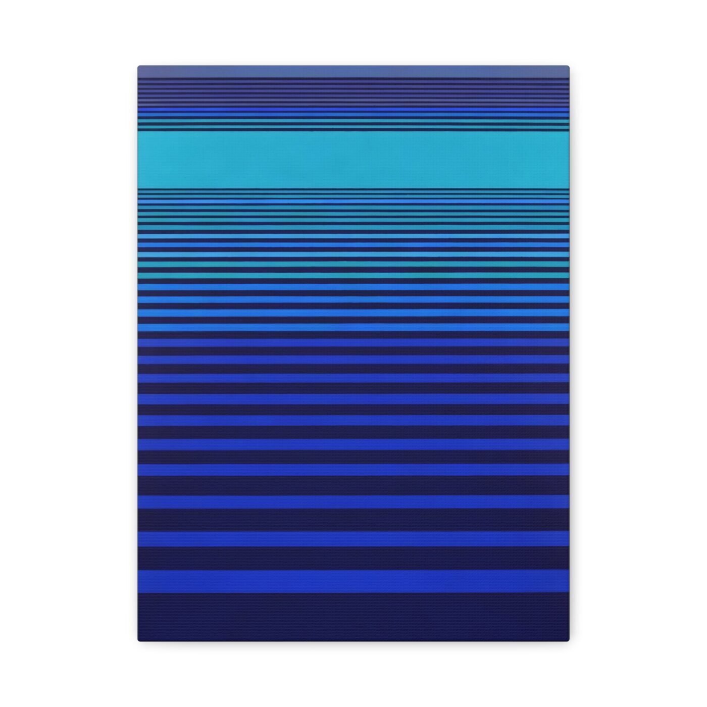

I am Alex Ward. I make hard-edge geometric abstraction using calculated colour blocks and architectural proportion. Every line is measured. Every proportion is a decision. This piece is a tower that climbs in intervals, each block a shift in hue from teal through emerald to sage, held together by a grid that does not wobble.
There is poetry in precision. You just have to stop rushing past it.
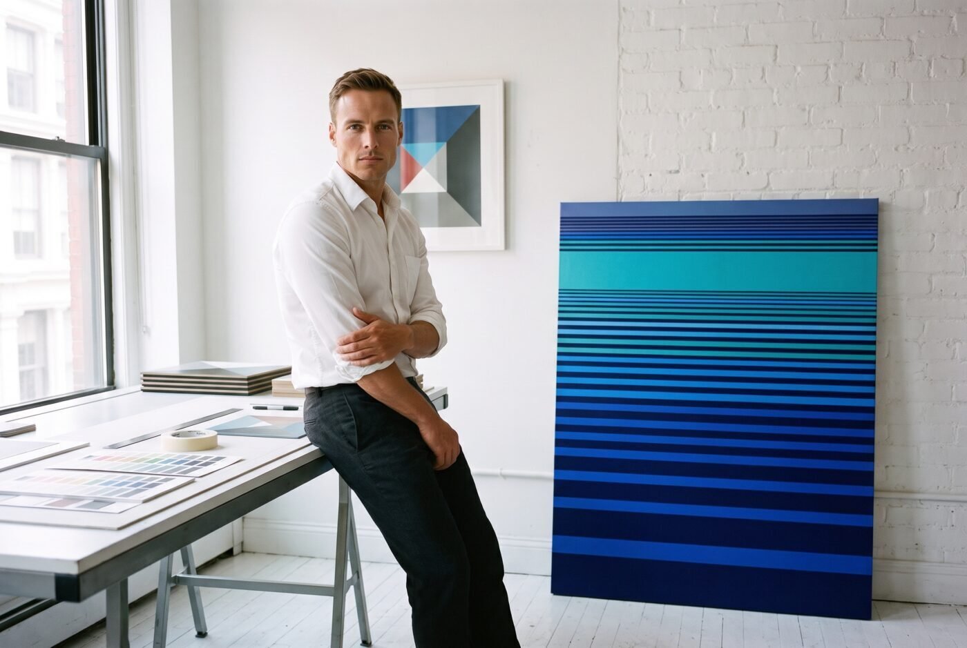
The intervals do not taper
Most vertical compositions narrow as they rise because that is how weight works in the real world. This one does not. Each block is the same width, stacked in exact intervals from bottom to top. The tower climbs without perspective, without foreshortening, without the visual cues that would make it stand as a building.
That is the one place the precision is allowed to lie. The structure is impossible, but every measurement inside it is rigorous.
Ruby called the intervals strikingly crisp. They are. Each edge was taped and measured before any colour went down. The blocks do not bleed into one another. The gaps between them are as calculated as the blocks themselves.
The palette shifts as it stacks
I mix every colour before I touch the canvas. Nothing is decided on the wall. For this piece, I started with a deep teal at the base and shifted the hue in controlled steps as the tower climbed—through emerald in the middle third, ending in a pale sage near the top.
Each block is a single flat colour with no gradient inside it. The shift happens between blocks, not within them. What Valentina called a masterful tower of intervals is really just a refusal to let the colour wander once it is mixed.
The palette shift is visible but not dramatic. If you stand back, the tower reads as teal. If you look at the top and bottom separately, you notice the climb.
The grid was laid first
Before any colour, I laid out a grid in pencil. Every block in this piece answers to that grid. The proportions repeat: the width of one block is exactly half the width of another, and the vertical intervals are multiples of a single base unit.
Charlotte said the rhythm of intervals and colour blocks makes it a stand-out piece for modern spaces. She is right, but the rhythm is not intuitive. It is calculated. The grid makes sure of that.
A designed room that is already finished and needs one exact thing on the wall will recognize this immediately. Someone who likes order and notices when a line is off will see the grid even if they cannot name what they are seeing.
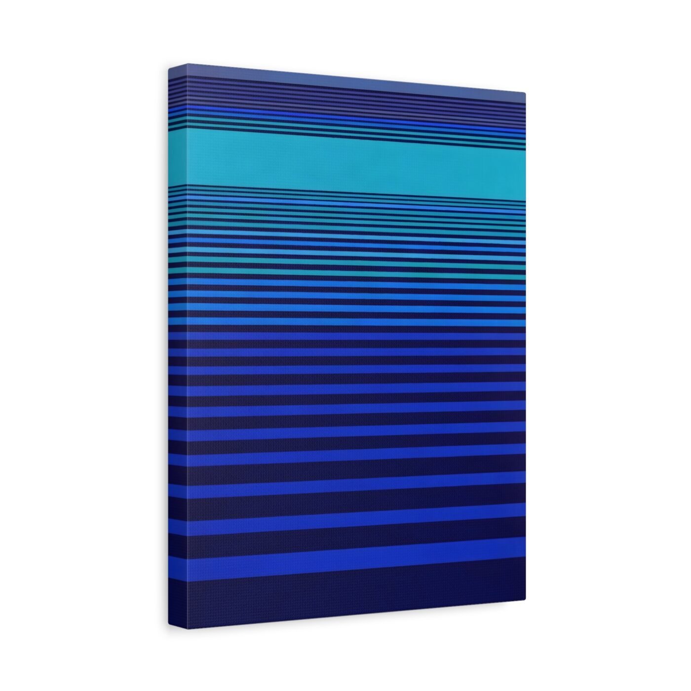
Intervals Stacking Teal is printed on museum-grade archival matte paper with pigmented archival inks, or on a cotton and polyester composite canvas stretched on a radiata pine frame with hanging hardware already on the back. Prints ship free within the continental United States.
This is for a room that does not need softening, for someone who wants a vertical on a quiet wall and will not ask the tower to make sense as architecture. It is not for a cluttered room or anyone who wants to see the hand shake.
Gallery-wrapped canvas, in 3 sizes — 12×16, 18×24, 24×32 in. Ships free within the continental US.