

I am not painting the place. I am painting the memory of the place. This one is a February morning in a harbour I have photographed two hundred times. The boat matters because it is the only thing not moving.
I work in poured light and sharp edges. The Nordic series is always the same question: what happens when something cold and still sits under something wild. A hull on ice. Sky breaking green overhead. The horizon holds both.
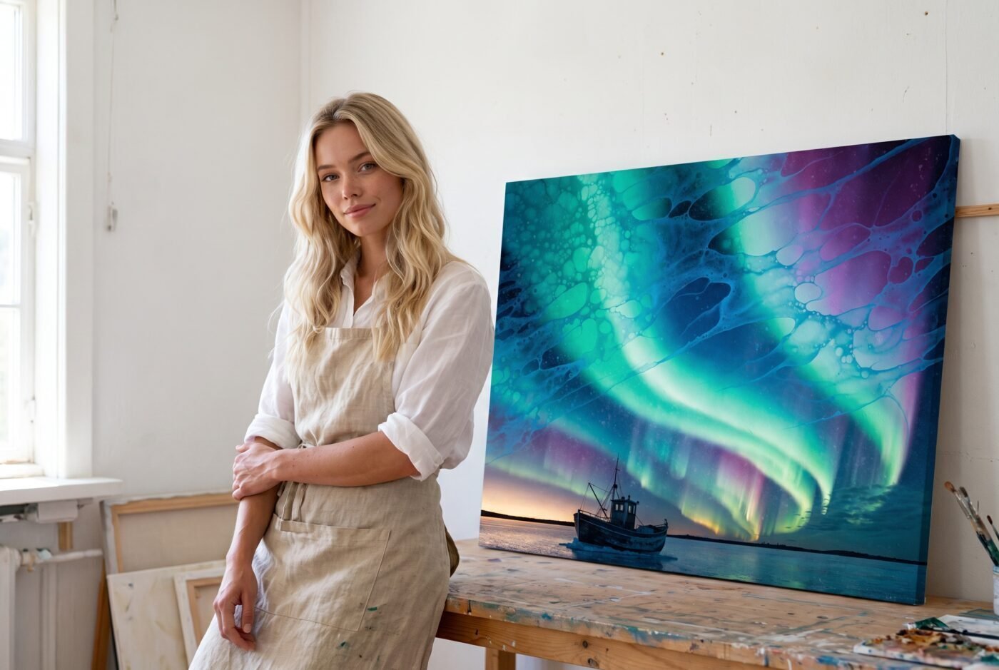
The aurora moves; the harbour does not
Ruby said the colours create an immersive experience. She is right, and that immersion is the work. I pour the green and magenta so they flow like real aurora — not blended, not gradual, but streaming. It takes three layers and about six hours of drying between them to keep the edges soft but not muddy.
The boat and the ice are photorealist on purpose. I paint them from a single reference photograph, sharpened until you can see the grain in the wood and the fracture lines in the frozen water. That stillness is what makes the sky readable as movement.
Valentina called this balance between photorealism and flowing magic my unique touch. I will take that. The balance is the whole piece.
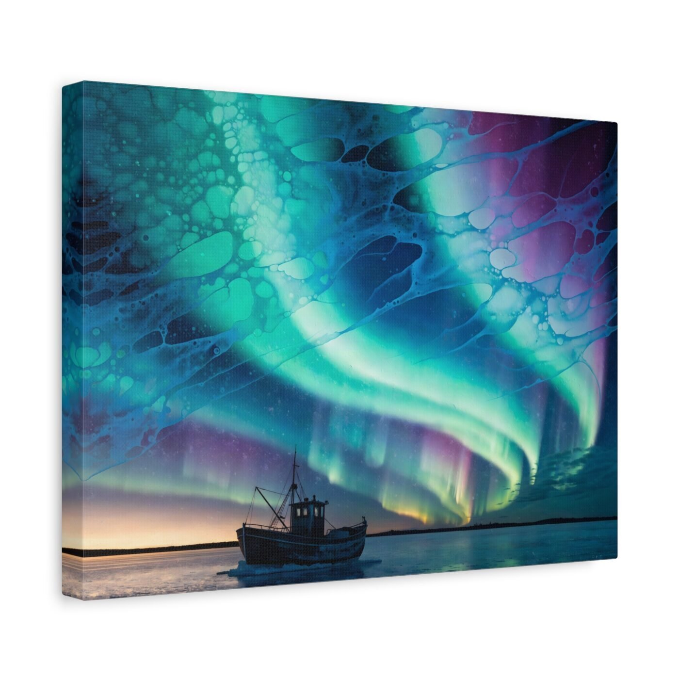
Green was the light I actually saw
The aurora that morning was green fading to pale magenta at the edges, the way it looks when it is strong but not directly overhead. I do not invent the colours. I choose the moment when the real light does what I need it to do: make the harbour look like it is under water, lit from above.
That green is cadmium and phthalo, cooled with a little titanium white so it stays luminous instead of going flat. The magenta is quinacridone, very thin. The canvas holds the layers better than paper would — this piece needs the depth.
Charlotte said the aurora’s vibrant pour makes this a focal point. It does. It is also a great deal of sky, which means a great deal of colour. This is not a neutral piece.
For a room that can take green on the wall
This is for someone who wants the Nordic palette — cold blue, pale gold, winter green — and does not mind the magenta. It works in a room with white walls or very pale wood, somewhere the light can meet it.
Not for a room already full of colour, or anyone who wants something quiet. The aurora is the whole top half of the canvas. It will not sit politely next to anything else.
Gallery-wrapped canvas, in 3 sizes — 16×12, 24×18, 32×24 in. Ships free within the continental US.
