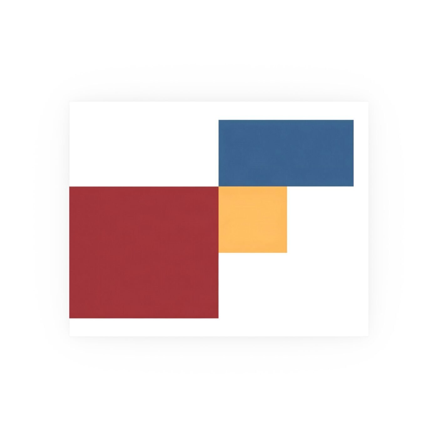

Three blocks. Three colours. Zero compromise.
Ward’s Equilibrium Attained is structural chromatics doing exactly what the name promises: colour as architecture, geometry as structure, and a composition that resolves the instant your eye finds it. This is not decoration pretending to be design. It is design confident enough to stand still.

What arrives in landscape
The poster format at 24×36 inches gives Ward the horizontal span he needs. These three blocks—a warm ochre rectangle, a cool charcoal mass, a pale neutral plane—occupy asymmetric positions across the width, but the weight distribution is so precise you feel it before you think it. That is not an accident. Ward works in grids and ratios, and the satisfaction here is in watching three unequal shapes hold each other in place through pure proportion.
The matte surface is critical. Any gloss would break the architectural read. Ward’s edges are hard, his planes are flat, and the finish preserves that. You are looking at colour blocks, not at light reflecting off ink. The difference is the entire point.
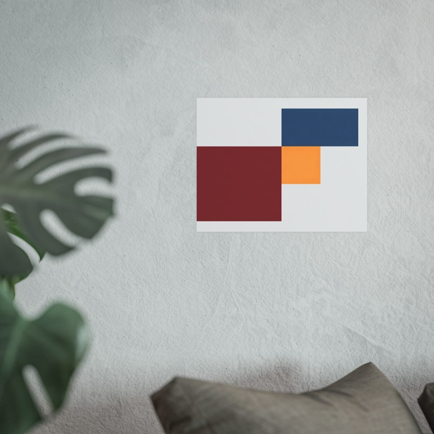
Precision you can measure
This is museum-grade archival matte paper, thick enough to stay flat under its own weight without curling at the edges, printed at 300 DPI, which means the borders between colour fields are genuinely clean. No bleed, no fuzz, no apology. When Ward draws a line, the printer holds it.
The palette is three notes and they are all working. The ochre warm enough to feel like sunlight on concrete. The charcoal cool enough to anchor without going funereal. The neutral plane doing the job neutral planes exist for: giving the eye a place to rest while the other two hold tension. The gamut—the range of colours the printer can actually reproduce—is wide enough that none of these read as compromise. What Ward specified is what landed on paper.
The frame decision
Ward’s work does not need a frame to function, but it does need a frame to last. The matte surface shows fingerprints, and unprotected paper corners fold if you look at them wrong. A simple black or natural wood frame with standard glass keeps the piece flat and protected without adding visual noise. You are framing geometry. Keep it geometric.
Ships free within the continental United States, and at this size it arrives rolled in a tube. Expect to flatten it under books for 24 hours before framing or pinning. That is not a flaw. That is how paper works.
Why this one holds
Ward has been refining this vocabulary—hard edges, calculated colour, impossible structures that somehow balance—across his entire run, and Equilibrium Attained is him working at full confidence. No ornament. No hedging. Three blocks that should tilt but do not, printed clean enough that the effect survives scrutiny.
The poster format is the right call here. This composition does not need texture or depth. It needs span, flatness, and colour fidelity, and a well-executed poster delivers all three without asking you to pay for canvas you do not need.
See the full piece and specs at Printasso, where Ward’s full structural chromatics run is live and where you can compare this to his earlier grid work if you want to see how he got here.
Matte fine art poster, in 3 sizes — 14×11, 20×16, 24×18 in. Ships free within the continental US.