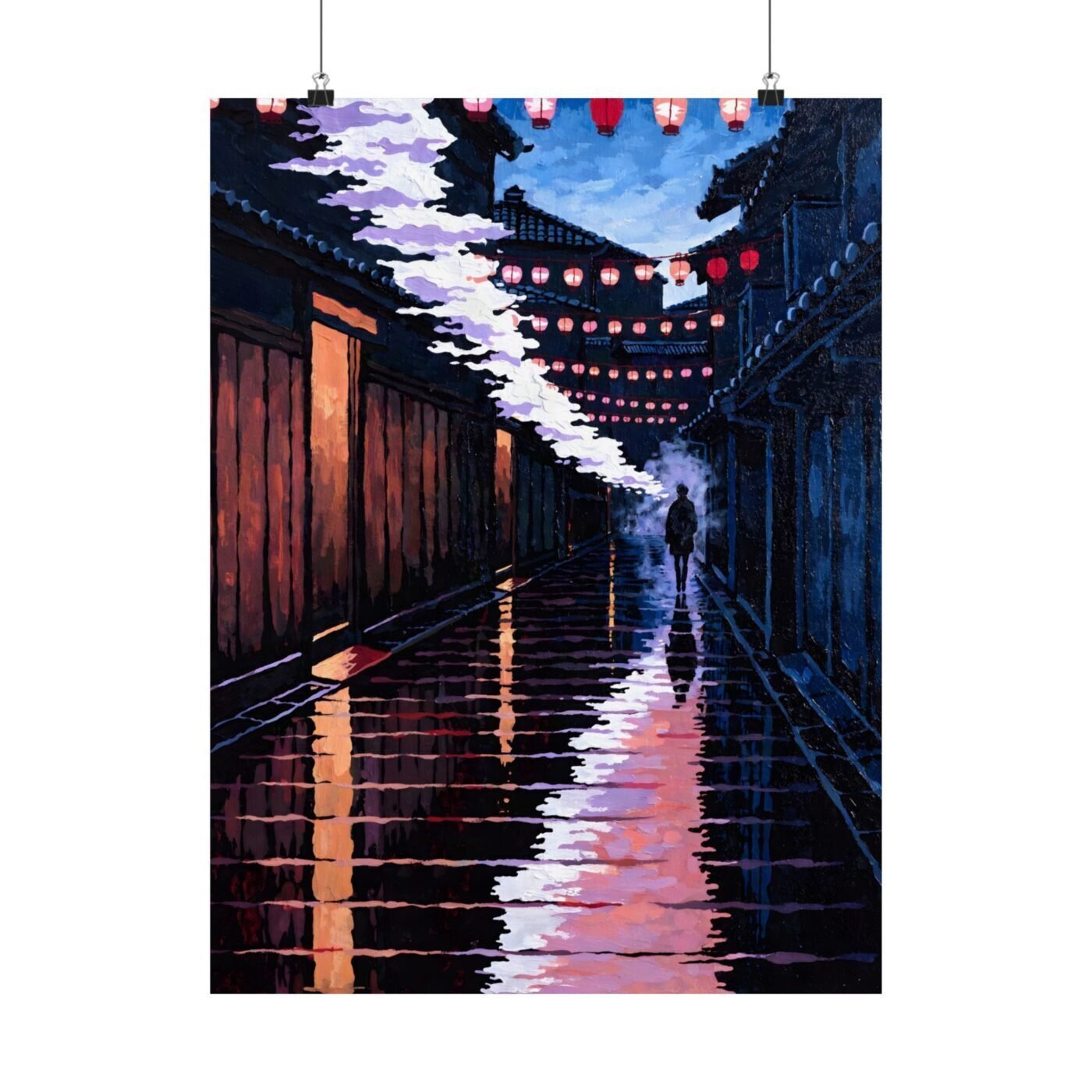

The person in the frame is always walking away because that is when a place becomes a memory.
I paint rain-lit paths in Kyoto and Tokyo. Lanterns, wet stone, one distant figure with an umbrella. The figure is never facing you. They are mid-turn, about to leave, or already gone past the corner. That choice is the center of the work.
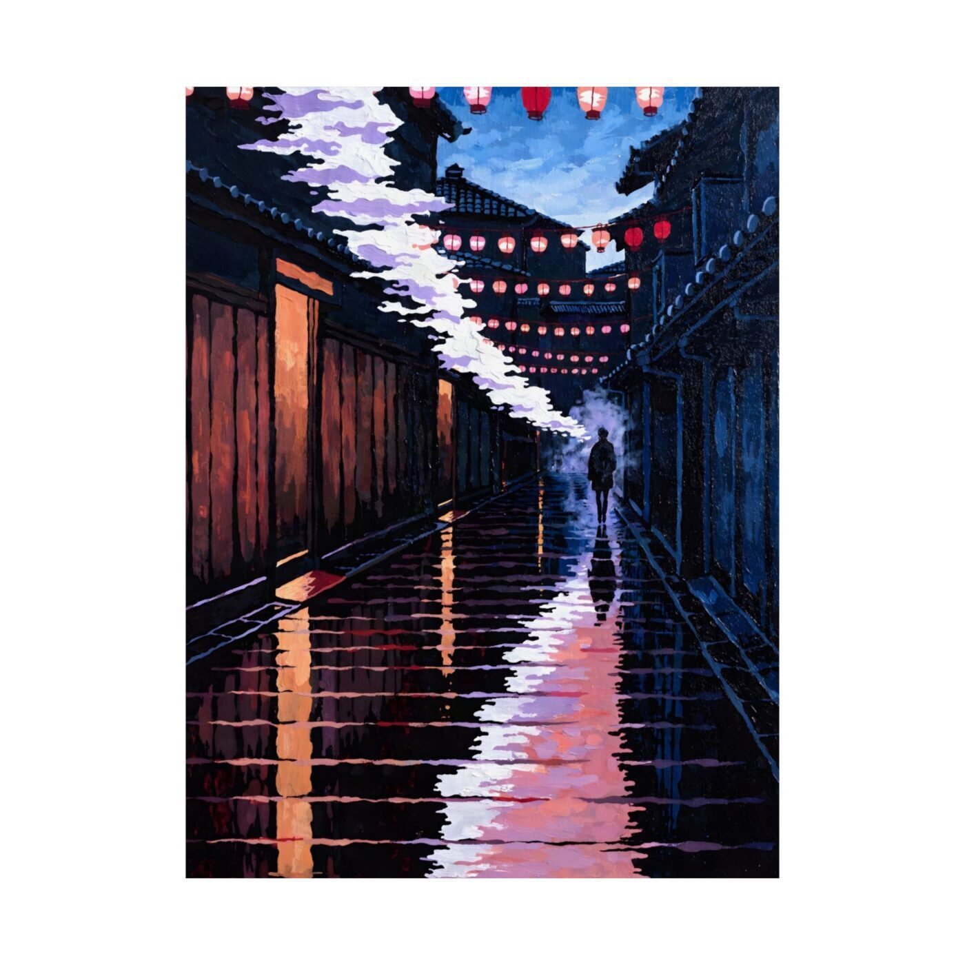
This piece is a Pontocho alley at dusk, after rain.

Ruby called the reflections mesmerizing, and she is right about the how but not the why
Wet stone takes lantern light and doubles it. The reflection is not a copy. It shifts the colour – warmer, softer, spreading where the original stays sharp. I use the knife for that spread, dragging orange into indigo so the edges stay uneven.
Ruby noticed the glow. What makes it work is that the stone is uneven. If the path were smooth, the reflections would be clean and the piece would feel like a photograph. The texture – small ridges, the places where stone does not sit flat – is what makes the light feel like it is moving.
I do not paint rain. I paint what rain leaves behind.
The figure is there so you notice them leaving
One small shape, turning the corner. Dark coat, no face. They are not the subject. They are the moment the viewer realizes they are standing still and someone else is walking away.
That is when a lane becomes a lane you remember. Not when you are in it. When you are watching someone else disappear into it and you are not following.
I tried versions with the figure closer, face visible, walking toward you. Every one felt like an invitation. This piece is not an invitation. It is the memory of having been somewhere and knowing you will not be back tonight.
The palette is four colours and the fifth is the paper
Indigo for the far stone and the sky. Lantern orange. Maple red on the sign above the door. Cherry pink where the lantern light catches the edge of the alley. The fifth colour is the paper itself, which I leave unpainted in three places: the lantern glass, the wet highlights on the stone, and the sliver of sky between the buildings.
Charlotte called it vibrant. It reads that way because almost none of the paper is white. Even the highlights are off-white, warmed by the orange around them. The contrast comes from value, not colour. Dark indigo next to mid-value orange next to pale pink. That is the structure.
I work wet-on-wet for the reflections and dry-on-dry for the stone. You can see the line where the techniques meet if you look at the bottom third of the piece.
For
For people who like rain better than sun, and pictures of places better than pictures of faces. Not for anyone who wants a lane they could walk down. This one, you watch someone else walk down while you stay where you are.
Matte fine art poster, in 3 sizes — 11×14, 16×20, 18×24 in. Ships free within the continental US.