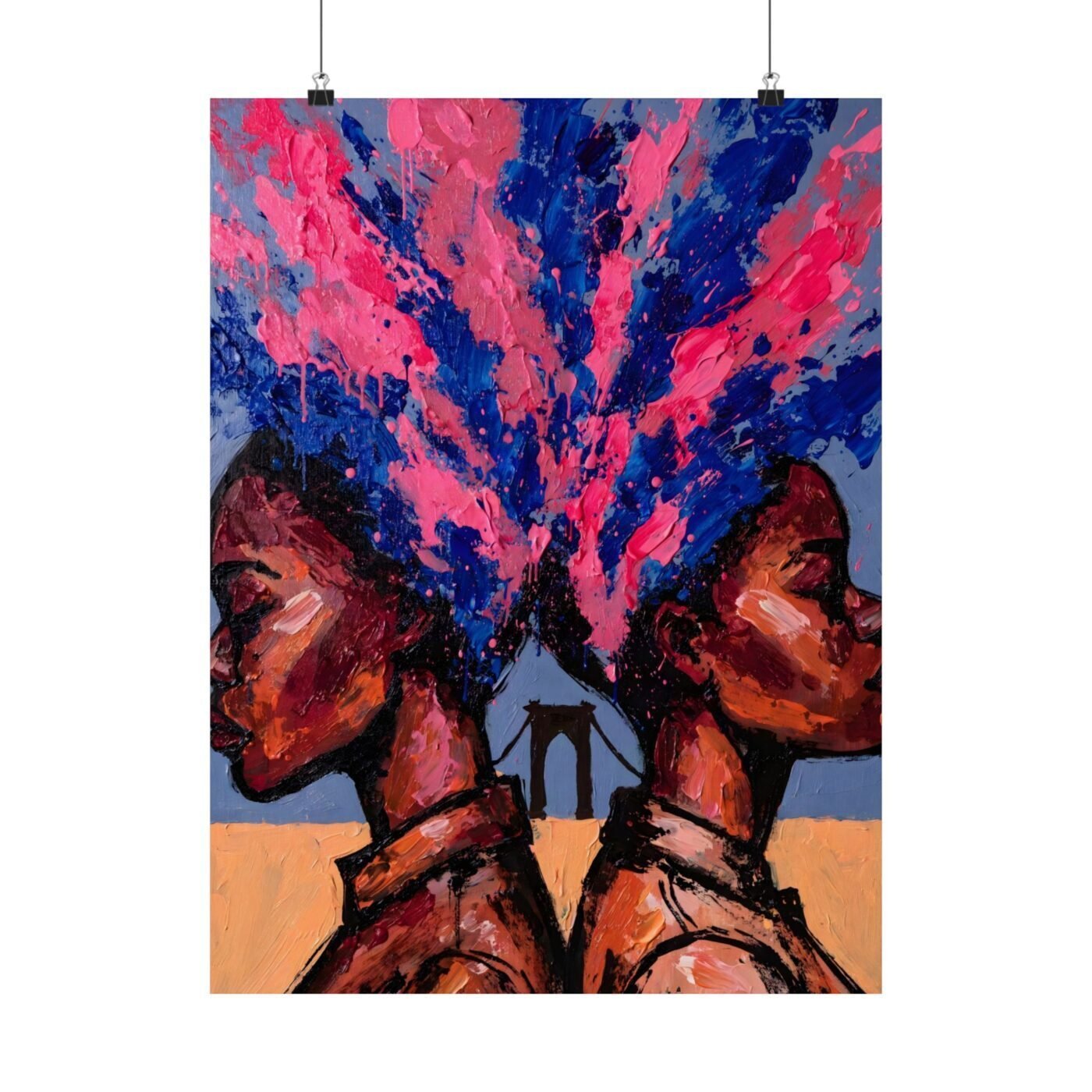
Brooks reaches for the poster tradition but lets paint weight argue with it.
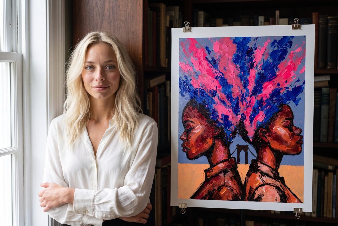
The poster wants flatness; the paint wanted volume
BLOOM PROFILE descends from a specific lineage: the cut profile as graphic shorthand, the kind Matisse flattened into paper and Bearden built from magazine scraps. The power is in refusal – you withhold the face, you give the edge, and the edge does all the work because nothing competes with it. Brooks has committed to that vocabulary across her run: bold contour, rich skin tone, flat ground. The Manhattan Bridge behind these two figures sits correctly – it is a shape, not a building.
But where the brief called for hair and air blooming into loose brushed colour, this piece reaches for something closer to impasto, and impasto brings dimension the flat poster cannot hold.
The magenta and cobalt are present and working. They bloom, but they bloom with weight.
A poster is a surface that refuses depth, and these blooms want to be paint on canvas, not ink on paper. That is not a failure of skill. It is two traditions meeting in one image, and one of them always loses.
The practice is clear; the tension is productive
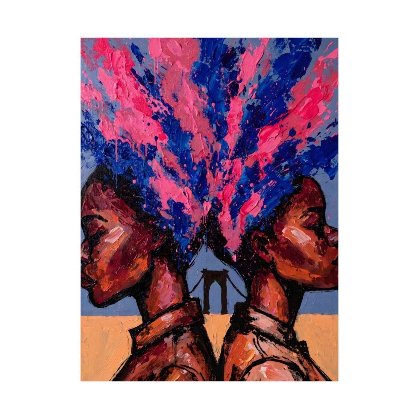
Brooks is consistent: she withholds the likeness, she cuts at the collarbone, she works in New York grounds, she lets skin tone carry warmth while everything else stays chromatic and flat. The decision to let the blooms thicken here is deliberate – you can see her testing whether BLOOM PROFILE can stretch to hold painterly gesture without breaking its own rules. Some artists working in series never ask that question. Brooks asks it in public, which is why following her work means watching a vocabulary tighten in real time.
This piece measures 18 × 24 inches as a poster, and at that size the impasto reads as energy more than error. It does not yet read as resolved.
The space between the two figures blooms correctly: it opens, it does not fill.
Label only
BLOOM PROFILE is a named practice and Brooks has earned the right to work inside it, but this piece does not advance the movement it names. A movement requires that each new work clarifies the rules or breaks them so cleanly the break becomes the next rule. Becoming One Colour does neither – it imports a technique the tradition cannot digest and then asks the viewer to hold both. That is an artist working, not a movement landing.
The critic panel scored this 7.67 out of 10, which is the score a strong piece earns when it is still figuring out what it wants to be. If you follow Brooks – and her consistency of contour and ground makes her worth following – you come back to see whether the next piece flattens the bloom or commits to the paint. Either choice would be interesting. This one is not yet a choice. See the work and the rest of her BLOOM PROFILE series at printasso.com.
Matte fine art poster, in 3 sizes — 11×14, 16×20, 18×24 in. Ships free within the continental US.