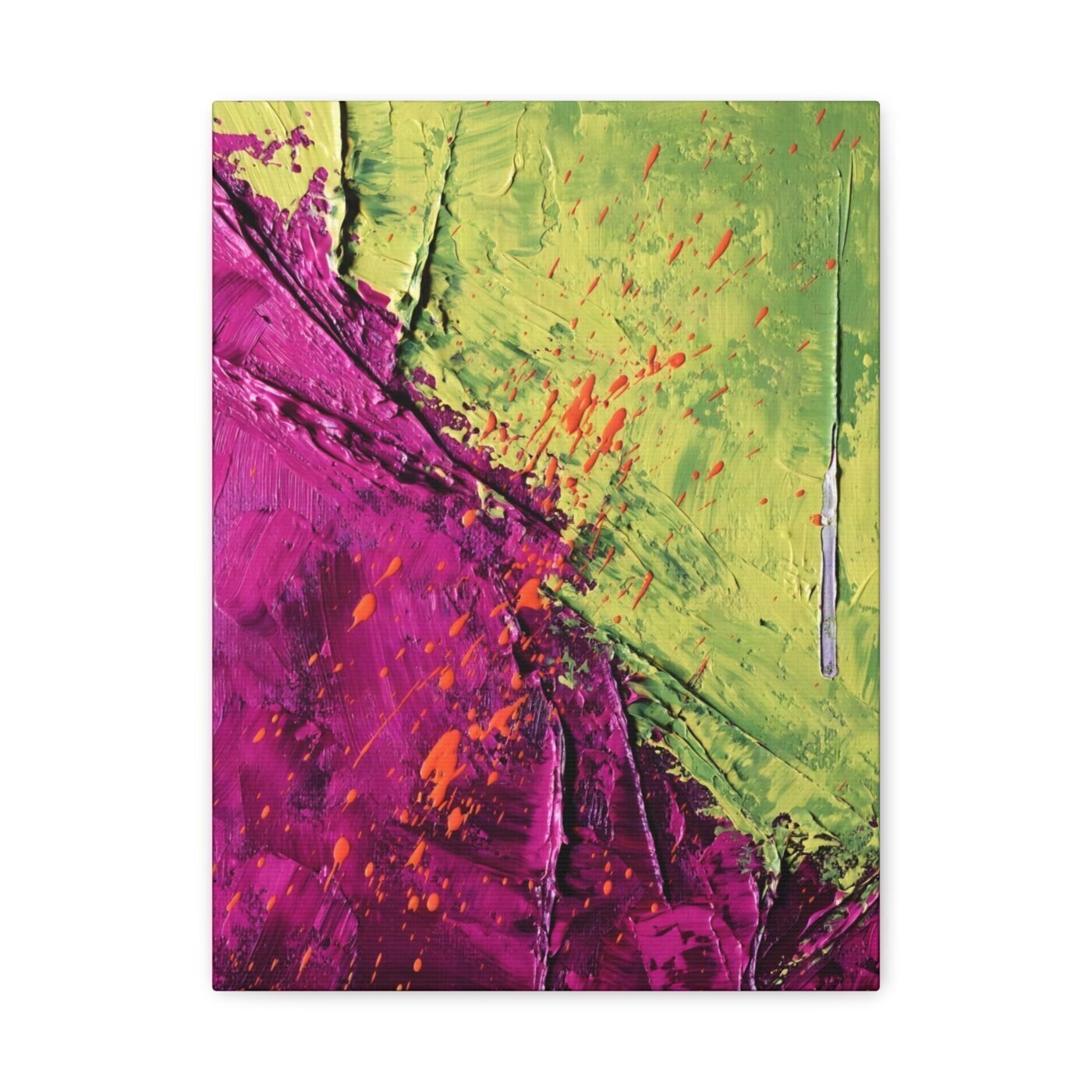

I wanted to see what happens when neither colour backs down.
I work at four metres because that is the scale where a body stops negotiating with paint and just moves. Green on one side, magenta on the other, both at full volume. Most painters would blend the centre or soften the edge. I drove them into each other until the friction was louder than either colour alone.
The impasto is thick enough to cast shadows. That is not decoration. It is what happens when you refuse to let pigment sit flat.

Ruby called it visceral and she is right
Ruby wrote that the clash of magenta and chartreuse creates a visceral experience. She saw the texture first, which is exactly the order I built it in. The colour comes second. You feel the surface before you read the palette.
Chartreuse is what she called it. I am calling it green because that is what it does in the room—it holds ground. Magenta is the aggressor but green refuses to move.
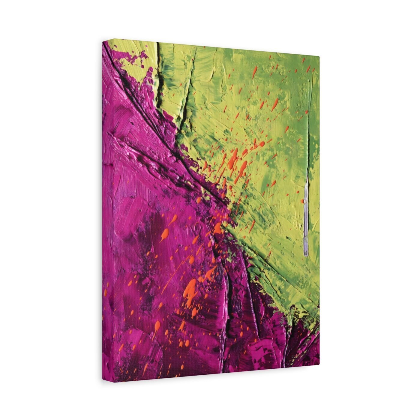
This is the third standoff piece
The first two were red against blue, then orange against violet. Complementary pairs, but not balanced. One always advancing, the other dug in. This one is different because neither has the advantage.
The emotional arc is not resolution. It is sustained pressure. I keep coming back to that—the moment before something gives, held as long as the paint will let me.
For people who want the argument, not the answer
This is for you if you have ever stayed in a conversation past the point where it was comfortable because the friction was worth more than the peace. It is not for people who need a painting to confirm what they already think.
Charlotte called it breathtaking. I would call it relentless.
Gallery-wrapped canvas, in 3 sizes — 12×16, 16×20, 18×24 in. Ships free within the continental US.