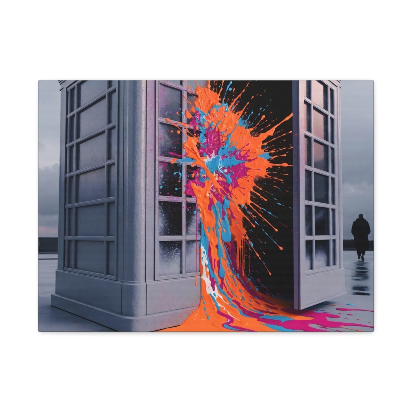

The box is closed geometry; the orange was never going to stay inside.
I am Kai Reynolds. I work in hard-edged grey vectors with one saturated aerosol-and-pour eruption per piece—London greys holding Lagos colour until the structure cracks. This one is a phone box, door open, orange already moving through the gap.

The grey stays vector, the orange stays wet
The phone box is built in Illustrator: clean anchor points, locked paths, no texture. It reads as object, not painting. Then the orange—fluid acrylics thinned with medium, poured and angled until they move like they are still liquid on the canvas.
I do not blend the two. The eruption starts at the door edge and sprays outward, aerosol energy meeting pour physics. One method does not become the other. The join is the whole point.
Exactly one burst, placed where the structure opens
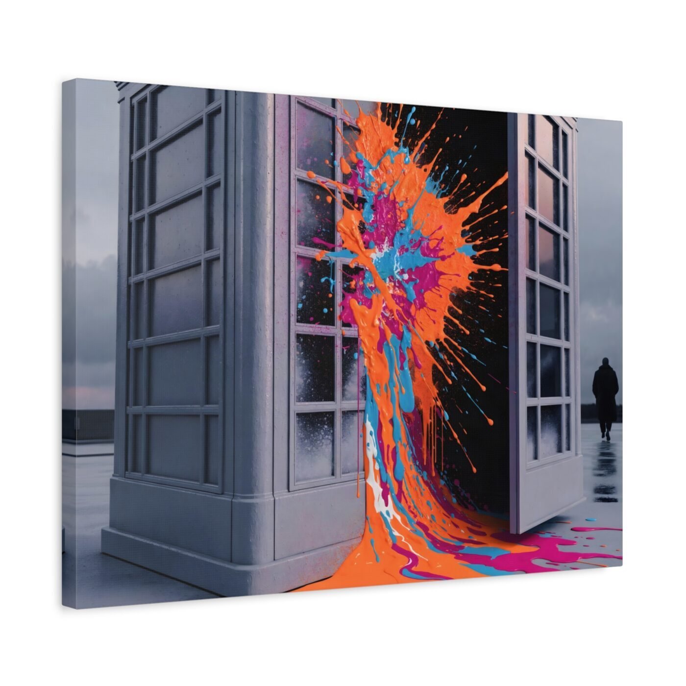
Every piece in this run has one eruption. Not two, not a field of them. One break, one colour event, always placed where the grey subject already has a gap: a door, a window, a threshold somebody built in.
The phone box door is hinged open maybe twenty degrees. The orange is not exploding through the glass or cracking the frame—it is pouring through the opening that was always there. Eruption, but the architecture invited it.
Ruby called it energetic and compelling; Valentina said the tension worked
Ruby scored it 9/10 and said the vivid eruption perfectly contrasts the sombre grey. I will take that. Valentina called the balance captivating—vibrant eruption, muted structure, the two holding each other in place. That is exactly what I am chasing: not colour overpowering form, but colour proving the form was never as locked as it looked.
This is for anyone who wants a London icon that does not sit politely. If you need the phone box to stay a nostalgia object, this will read as vandalism.
Gallery-wrapped canvas, in 3 sizes — 16×12, 24×18, 32×24 in. Ships free within the continental US.