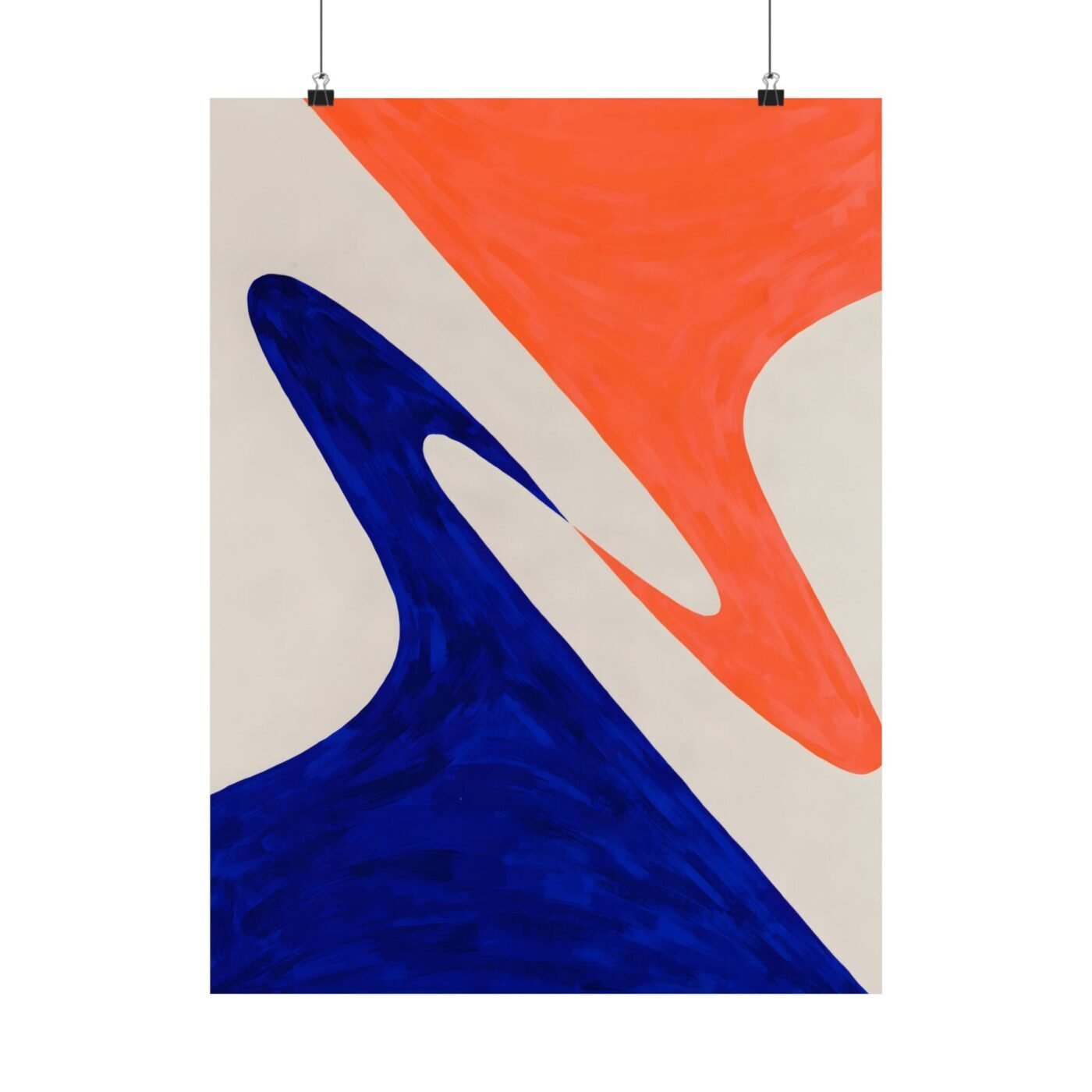

I painted two gestures that could resolve into one and then stopped myself.
I work at four metres because scale changes what a brush can say. A stroke at that size has momentum—you commit with your whole body, and by the time you see where it is going, you are already there. Most of the time I let them crash into each other and see what survives. This time I didn’t.
I am chasing the moment just before contact. Not the aftermath, not the memory of it—the second when two things are about to collide and have not yet decided what they will become. That gap is where I live as a painter.
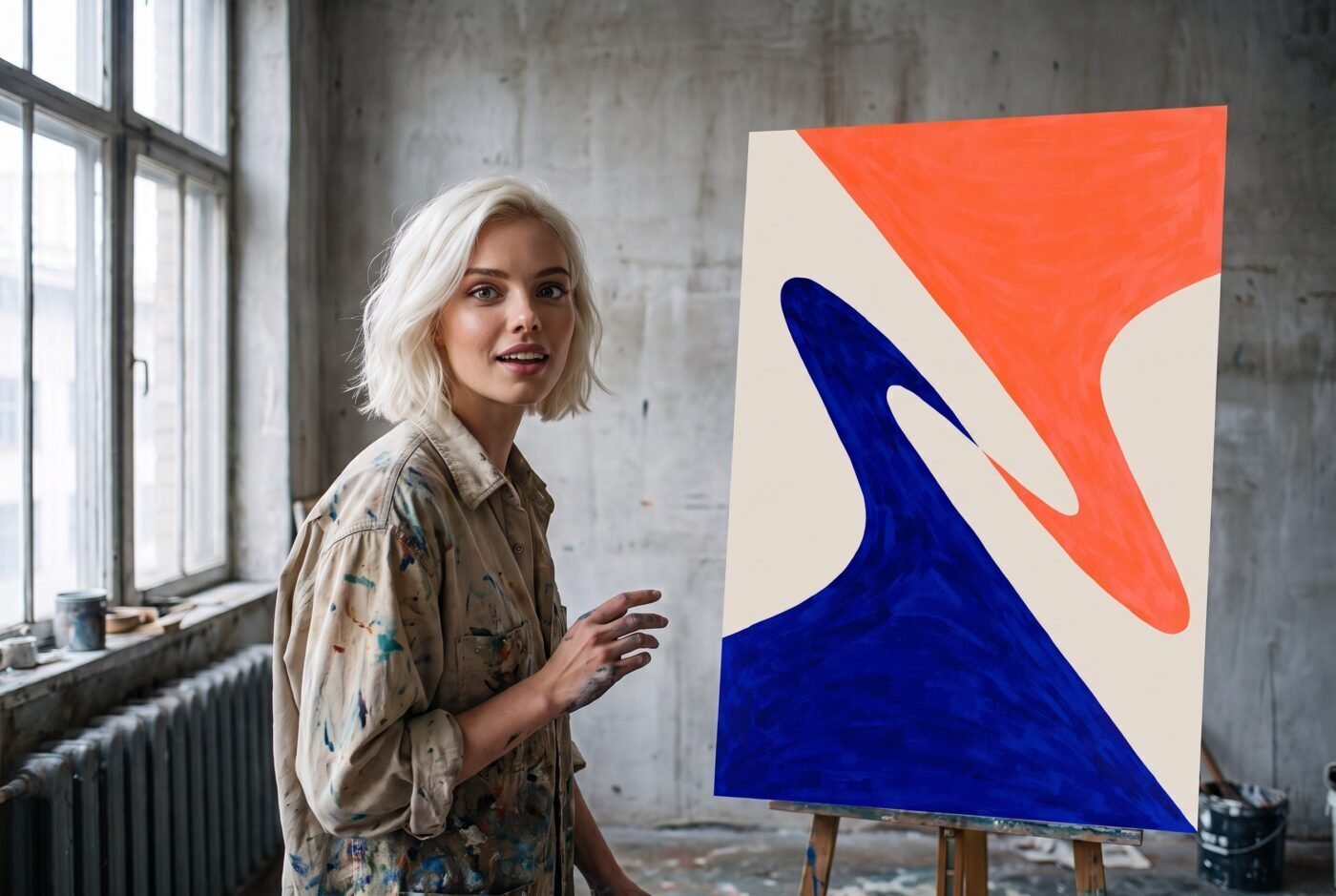
Ruby says the colour fields are flat and she is right
Ruby wrote that the flat colours leave emotional depth lacking. She is correct about the flatness. I left them flat on purpose.
When Valentina called it a daring collision of cobalt blue and searing coral, she named exactly what I wanted—those two slabs of colour had to hit like walls, not like atmosphere. Depth would have softened the refusal. I needed the gestures to stay surfaces that cannot penetrate each other, only scrape past.
The impasto is thick enough to cast shadows where the brushstrokes stop. If you stand close, you can see the ridge where I lifted the brush and did not bring it back down. That is the gap Ruby is reading as absence. I am reading it as the thing the piece is about.
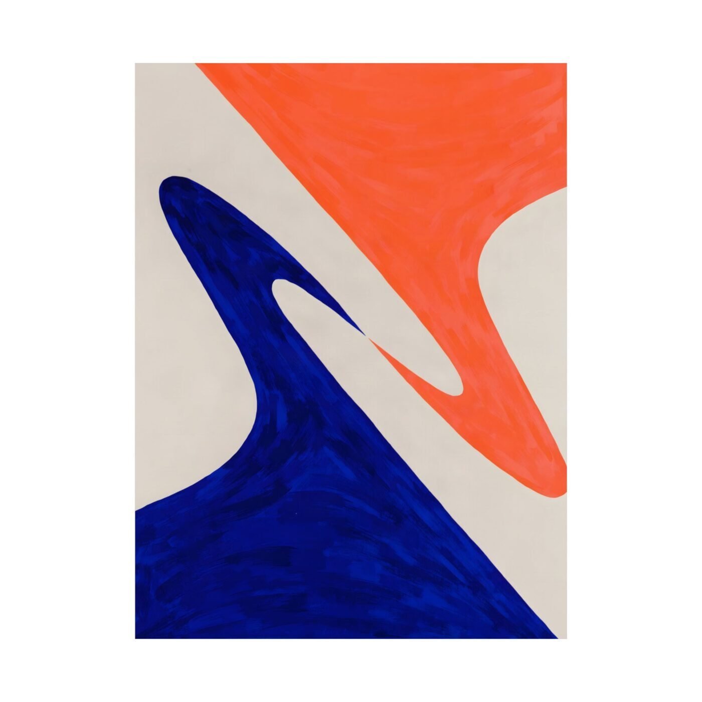
The composition has no centre because neither gesture wins
Charlotte wrote that the tension refuses to let go, and that is the structure holding it up. One gesture sweeps in from the left, cobalt and committed. The other comes from the right in coral, just as sure of itself. They meet at an edge I could have blurred in thirty seconds.
I have watched people stand in front of this piece and wait for it to resolve. It does not resolve. The coral does not win, the cobalt does not win, and they do not merge into a third thing. They stop.
At four metres that stop reads as a decision, not a mistake. At poster scale it still reads, because the gestures stay whole and the gap stays visible. You lose the shadow the impasto throws, but the refusal is there in the shape of the strokes themselves.
This is for people who mistrust easy reconciliation
If you want gestures that complete each other or colours that blend into harmony, this will frustrate you. It is designed to.
This is for anyone who has stood in a room with someone and known that the distance between you was the only honest thing left. The space where two forces stop just short of touching is not a failure of contact. Sometimes it is the most accurate description of what is actually there.
Matte fine art poster, in 3 sizes — 11×14, 16×20, 18×24 in. Ships free within the continental US.